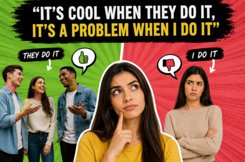
Before every joke became a meme template, funny maps had their own little internet moment. One of the best examples was the U.S. stereotype map: a familiar map of the country covered with blunt, silly, sometimes unfair labels about different regions.
The appeal was easy to understand. You found your state, laughed, got annoyed, sent it to a friend, and argued about whether the label was accurate. That quick mix of recognition, insult, and local pride is why stereotype maps spread so well.
Quick Take
Stereotype maps went viral because they turned geography into a joke people could instantly join. They were simple to read and built around a question almost everyone could answer: “What does this map say about where I live?”
They were also early examples of what we now call meme geography. Today, people use TikTok, Reddit, Instagram, and X to joke about states, cities, accents, food habits, weather, driving styles, rent, sports loyalties, and regional personalities. Stereotype maps did the same thing in one image.
What the Old NerdLike Post Was Probably Sharing
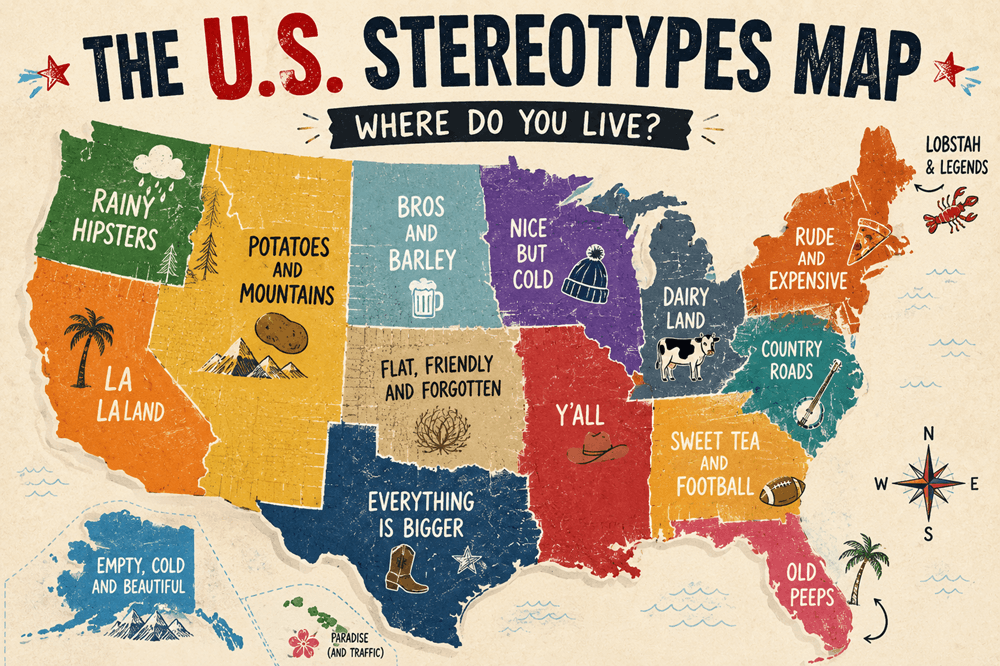
The original NerdLike page was likely a quick image or link post pointing to a humorous U.S. stereotypes map circulating in 2011. The old URL slug suggests a title close to “The U.S. Stereotypes Map: Where Do You Live?” That fits the early blog style perfectly: one funny image, one short caption, and a question that nudges readers to find their own region.
One close match from that period was a tongue-in-cheek U.S. map by blogger and artist Haley Nahman. Gadling described it as a map with regional labels like “rainy hipsters” in the Northwest and “old peeps” in Florida. Anna Brones also reposted the map with the short line, “Rainy hipsters. Sounds about right.”
So the old NerdLike post probably was not a serious geography article. It was likely a quick internet find: funny map, quick reaction, and an invitation for readers to laugh or complain about their state’s label.
What Was a U.S. Stereotypes Map?
A U.S. stereotypes map is usually a regular map of the United States with place names replaced by jokes, clichés, or exaggerated labels. Instead of showing Oregon, Florida, Texas, or New York in a neutral way, the map turns each region into a punchline.
Some labels are light and silly. Others are based on food, weather, politics, accents, fashion, celebrities, sports, or lifestyle clichés. A few can be lazy or unfair. That tension is part of the format. People enjoy seeing familiar places reduced to a joke, but they also push back when the joke feels wrong.
Why Maps Make the Joke Work
Maps look official, even when they are ridiculous. That is part of the humor.
A stereotype map borrows the visual language of geography, then fills it with pure opinion. The shape of the country makes it feel organized. The labels make it feel chaotic. The result is both fake and weirdly convincing.
That contrast is what makes the format fun. A normal map says, “Here is where things are.” A stereotype map says, “Here is what people assume about these places, whether or not it is fair.”
Why These Maps Were So Easy to Join
A stereotype map is instantly interactive. You do not just look at the image. You look for yourself.
That is the first hook. Where am I? What does it say about my area? Do I agree? Should I be offended? Should I send this to someone from that state?
The second hook is argument. These maps are usually not “correct.” They are meant to be exaggerated. That makes them perfect comment fuel. People argue that their city is mislabeled, their state deserves a better joke, or another region got roasted too gently.
The third hook is speed. A stereotype map does not require much reading. One glance tells you the format. A few seconds later, you already have an opinion.
The Internet Loved Maps Before It Loved Infographics
Funny maps fit neatly into the early blog era. Sites were hungry for images that could carry a whole post by themselves. A map could be clever, visual, funny, and easy to repost with a short caption.
This was also the golden age of lightweight internet discoveries. Blogs, Tumblr pages, design sites, travel sites, and humor sites passed around the same images with tiny bits of commentary. A stereotype map did not need a long explanation. It just needed a title like “Where do you live?”
That made the format perfect for quick internet culture. It sat somewhere between an infographic, a comic, a regional joke, and a personality quiz.
The Joke Is Really About Identity
Part of the fun comes from regional identity. People like joking about where they are from, even when the jokes are not flattering.
A New Yorker may roll their eyes at a map label but still share it. A Texan may complain that the joke is too obvious. A Midwesterner may laugh at being reduced to weather, politeness, casseroles, or corn. A Californian may accept the roast and then argue about which part of California it actually applies to.
That is what makes stereotype maps different from ordinary maps. They are not really about geography. They are about how places imagine themselves and how outsiders imagine them.
Where Stereotype Maps Can Go Wrong
There is a line between playful regional teasing and lazy stereotyping.
The light version is usually harmless: weather jokes, food jokes, driving jokes, accent jokes, city-versus-country jokes, and friendly regional rivalry. The weaker version punches down, flattens real communities, or turns people into crude labels.
The best stereotype maps make fun of the stereotype itself. The weakest ones simply repeat bias with a map outline around it.
That is why a modern look at these maps needs a little caution. Some are funny because they reveal how silly regional assumptions are. Others just recycle old ideas without adding anything clever.
How Meme Maps Evolved From the Format
Meme maps did not exactly replace stereotype maps. They absorbed the format and made it faster, rougher, and more participatory.
Today’s versions show up as fake data maps, “every state explained badly” posts, city rivalry maps, food-region maps, accent maps, weather maps, dating maps, sports-fandom maps, and intentionally chaotic Reddit maps. Some are carefully designed. Others look like someone made them in five minutes, which is often part of the joke.
The old stereotype map was usually a single polished image. Modern meme maps are more flexible. Someone can post a rough map, get corrected by hundreds of angry locals, and then make a follow-up joke about the corrections.
The basic engine stayed the same: take a familiar map, add a cultural joke, and wait for people to find themselves in it.
Why People Still Love Seeing Their Home Roasted
There is something weirdly satisfying about seeing your home reduced to one ridiculous phrase. Even if it is wrong, it gives you something to react to.
That reaction is the point. A stereotype map asks people to defend, laugh at, or explain their place. It gives them a tiny stage for local pride.
People do this offline too. Every region has jokes about the next town over. Every state has opinions about neighboring states. Every big city has neighborhoods with reputations. The internet simply made those jokes visual.
Why These Maps Feel Different Now
In 2011, a stereotype map could feel like a funny little blog discovery. Today, people are more aware of how stereotypes move through online culture.
That does not mean all regional humor is bad. It does mean the best version needs self-awareness. A map can joke about clichés without pretending they define everyone who lives there.
That shift is healthy. The internet is better when jokes can still be funny without flattening people. A smart stereotype map should feel like satire, not a label maker for real human beings.
What Makes a Good Stereotype Map?
A good stereotype map usually has a few things going for it.
First, the labels are specific enough to be funny. “People live here” is not a joke. “Rainy hipsters” is at least a recognizable cultural jab.
Second, the map understands exaggeration. It does not need to be accurate like census data. It needs to capture how people joke about a place.
Third, the humor should punch sideways more than downward. Teasing a region for weather, fashion, food habits, or local pride usually lands better than jokes built around identity-based insults.
Fourth, the map should invite debate. Half the fun is people saying, “No, no, that label belongs two states over.”
What We Can Learn From the Old Trend
Stereotype maps were not just funny images. They were early proof that the internet loves interactive identity content.
They worked for the same reason quizzes, Spotify Wrapped, personality charts, city rankings, and “only people from here understand” posts work. People like content that gives them a place to stand inside it.
A normal map shows location. A stereotype map turns location into a conversation.
Final Take
U.S. stereotype maps were simple, messy, and memorable. They turned the country into a joke board and invited everyone to find their region, laugh, complain, and send it to someone else.
They also helped point toward the meme maps we see everywhere now. The style has changed, but the basic idea is still alive: take geography, add a cultural joke, and let the internet argue.
The best version of this humor is playful and self-aware. It does not claim to explain a place. It shows how funny, wrong, and oddly personal our assumptions about places can be.